デザインシステムのためのカラーツール


Leonardo とは?
Leonardo は、UI デザインとデータビジュアライゼーションのためのアクセシブルなカラーシステムを作成・管理・共有できる唯一無二のツールです。
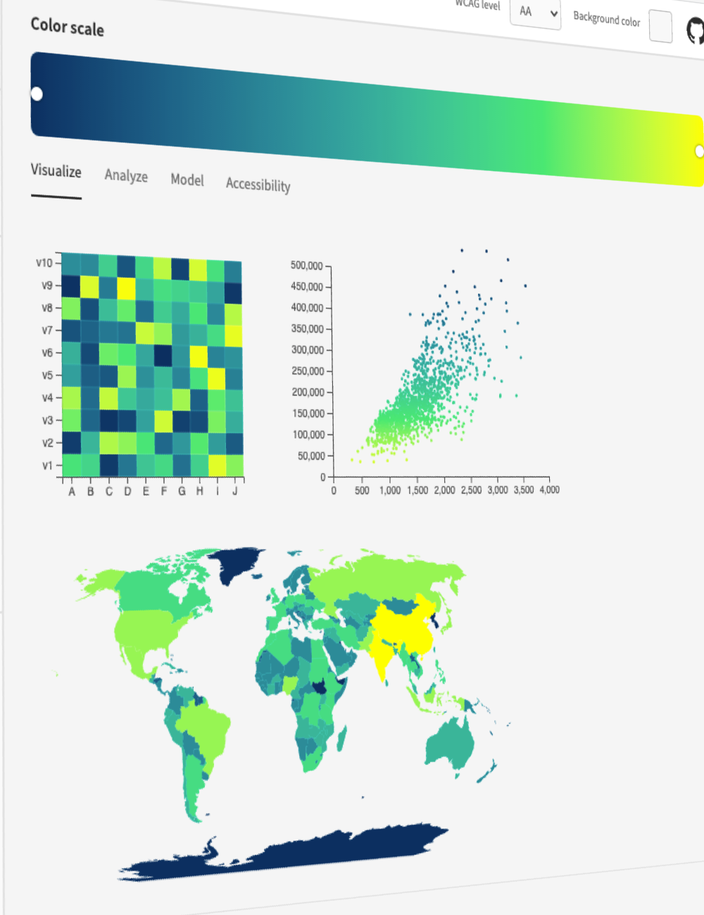
詳細なカラー分析
チャートや 3D モデルで、これまでにない視点からカラーテーマを評価できます。

正確なカラー制御
多様な色空間から選択し、知覚的にバランスの取れたカラースケールを作成できます。

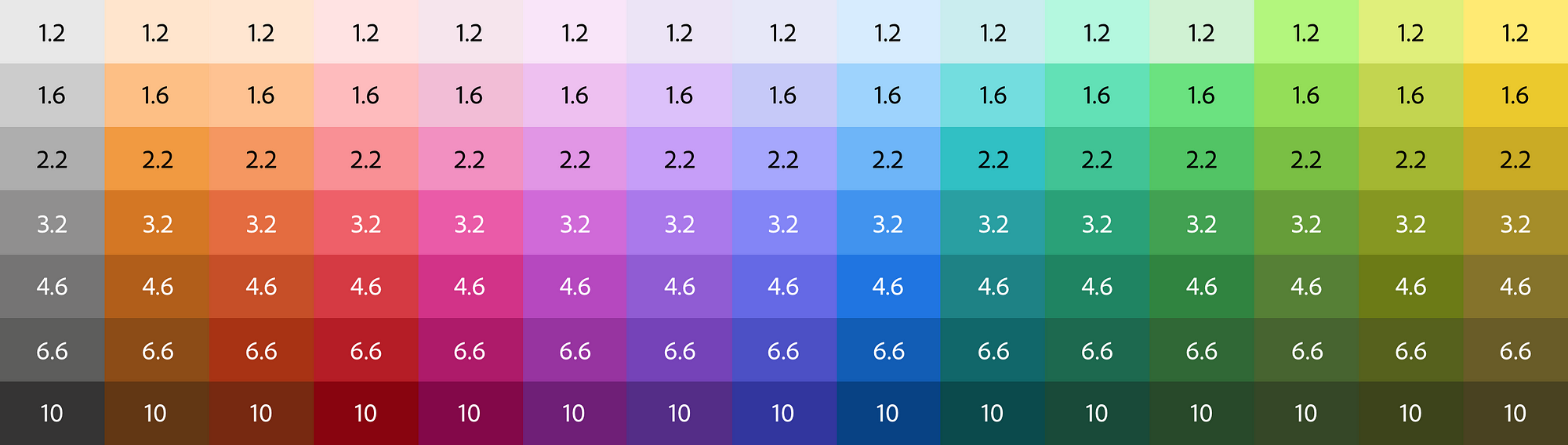
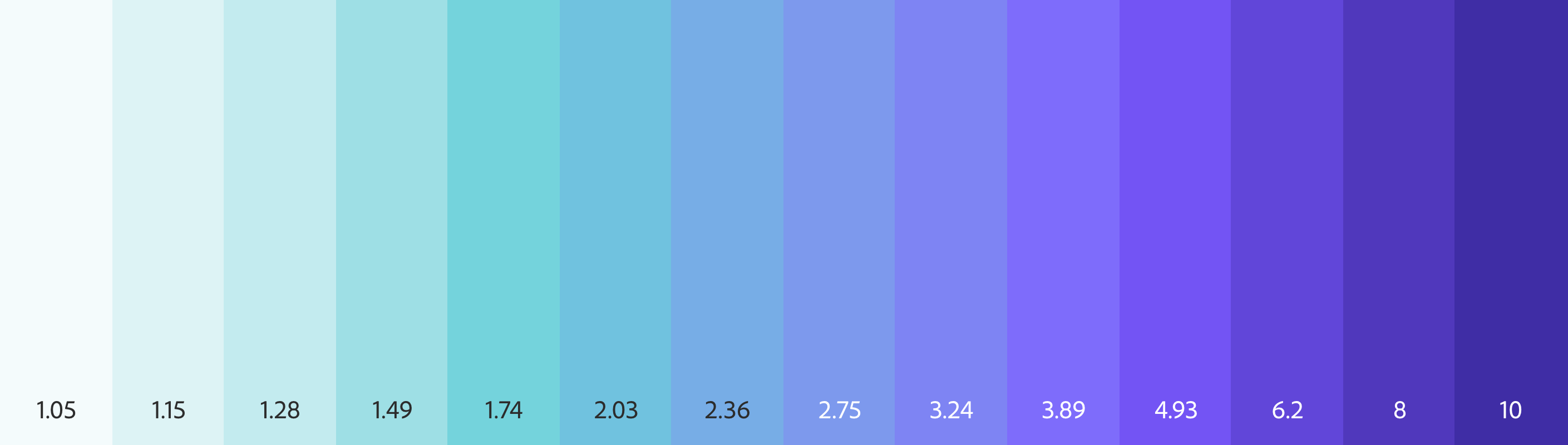
コントラスト比に基づく色生成
ターゲットのコントラスト比からスウォッチを自動生成するため、手動でコントラストを確認する必要がありません。
コントロールは明度入力と連動しており、目標とする明度でスウォッチを指定することもできます。
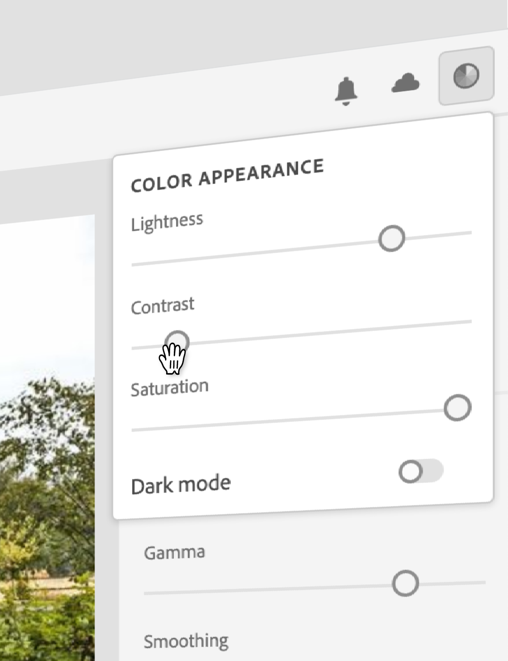
数秒でダークモード
Leonardo の適応型テーマなら、明るさ・コントラスト・彩度をこれまで以上に短時間で調整できます。

デザインリソースを効率化
テーマやカラースケールを SVG ファイルでダウンロードし、お好みのデザインツールにそのままコピー&ペーストできます。
エンジニア向けの出力
@adobe/leonardo-contrast-colors 向けのテーマパラメーター、CSS カスタムプロパティ、さらに w3c 作業ドラフトに準拠したデザイントークンを出力できます。
データビジュアライゼーション用スケール
知覚的に均一な連続・発散カラースケールをきめ細かく制御できます。
エンドユーザーのパーソナライゼーション
Leonardo の npm モジュール を使えば、ユーザーに包摂的で適応型のテーマを提供でき、体験全体のコントラスト・明るさ・彩度をユーザー自身が調整できます。
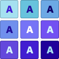
色覚特性に配慮した配色を簡単に
色を自動で入れ替えて、色覚特性に配慮したパレットを生成できます。
高度な設定により、色差を強調した表示や、3:1 以上のコントラスト比を満たす色だけを抽出することも可能です。

コントラストなどを比較
2 色間のコントラストを アルファ値 に対応した状態で確認できます。
色覚特性への配慮も推測に頼る必要はありません。Leonardo が各種色覚特性ごとに 2 色の色差を定量的に評価します。

オープンソース
Leonardo は Adobe のオープンソースプロジェクトです。コミュニティに参加して、さらに使いやすいツールへ育てていきましょう。

さらに詳しく知りたい場合は?
「クイックスタート」セクションや GitHub をチェックすると、Leonardo の使い方を詳しく学べます。あわせて「記事」セクションにも、Leonardo の背景やコアコンセプトを解説した参考資料を掲載しています。
Leonardo JS API
この API ドキュメントは、開発環境で @adobe/leonardo-contrast-colors を活用するための手引きです。
クイックスタート
パッケージをインストール:
npm i @adobe/leonardo-contrast-colors
パッケージをインポート:
CJS(Node 12.x)
const { Theme, Color, BackgroundColor } = require('@adobe/leonardo-contrast-colors');
ESM(Node 13.x)
import { Theme, Color, BackgroundColor } from '@adobe/leonardo-contrast-colors';
色と背景色を新しい Theme に渡します(追加のオプションは下記参照):
let gray = new BackgroundColor({
          name: 'gray',
          colorKeys: ['#cacaca'],
          ratios: [2, 3, 4.5, 8]
        });

    let blue = new Color({
          name: 'blue',
          colorKeys: ['#5CDBFF', '#0000FF'],
          ratios: [3, 4.5]
        });

    let red = new Color({
          name: 'red',
          colorKeys: ['#FF9A81', '#FF0000'],
          ratios: [3, 4.5]
        });

    let theme = new Theme({colors: [gray, blue, red], backgroundColor: gray, lightness: 97});

    // returns theme colors as JSON
    let colors = theme.contrastColors;
API リファレンス
Theme
適応型のコントラストベース配色を生成するクラス関数です。パラメーターは分割代入されるため、明示的に指定する必要があります。
| パラメーター | 型 | 説明 |
|---|---|---|
colors |
Array | テーマカラー生成に使用する Color クラスの配列。BackgroundColor クラスを 1 つ含める必要があります。 |
lightness |
Number | 生成されるテーマの背景色に設定する明度(0〜100 の整数値) |
contrast |
Number | テーマ内の全色のコントラストを増減させる係数(既定値は 1) |
saturation |
Number | テーマ内の全色の彩度を下げる 0〜100 の値(既定値は 100) |
output |
Enum | 希望するカラーの出力形式 |
セッター
| セッター | 出力の説明 |
|---|---|
Theme.lightness |
テーマの明度を設定 |
Theme.contrast |
テーマのコントラスト値を設定 |
Theme.saturation |
テーマの彩度を設定 |
Theme.backgroundColor |
テーマの背景色を設定(文字列を渡すと新しい BackgroundColor を生成) |
Theme.colors |
テーマで使用する色を設定(Color を渡す必要があります) |
Theme.output |
テーマの出力形式を設定 |
Theme.addColor |
テーマに Color を追加 |
Theme.removeColor |
Remove a Color from the theme |
Theme.updateColor |
Update a Color via its setters from the theme |
Theme.addColor = color
Add a Color to an existing theme
const red = new Color({...})

    theme.addColor = red;
Theme.removeColor = color
Remove a Color from an existing theme. Accepts an object with the Color's name and value, or by passing the Color class itself.
// Remove via color name
    theme.removeColor = {name: 'Red'};

    // Remove via Color class
    const red = new Color({...})
    theme.removeColor = red;
Theme.updateColor = {name, property}
Update a Color via its setters from the theme. Accepts an object with the name of the color you wish to modify, followed by the property and the new value you wish to modify.
const red = new Color({...})
    // Change the colors ratios
    theme.updateColor = {name: 'red', ratios: [3, 4.5, 7]};

    // Change the colors colorKeys
    theme.updateColor = {name: 'red', colorKeys: ['#ff0000']};

    // Change the color's name
    theme.updateColor = {name: 'red', name: 'Crimson'};
Supported output formats:
Available output formats conform to the W3C CSS Color Module Level 4 spec for the supported options, as listed below:
| Output option | Sample value |
|---|---|
'HEX' (default) |
#RRGGBB |
'RGB' |
rgb(255, 255, 255) |
'HSL' |
hsl(360deg, 0%, 100%) |
'HSV' |
hsv(360deg, 0%, 100%) |
'HSLuv' |
hsluv(360, 0, 100) |
'LAB' |
lab(100%, 0, 0) |
'LCH' |
lch(100%, 0, 360deg) |
'CAM02' |
jab(100%, 0, 0) |
'CAM02p' |
jch(100%, 0, 360deg) |
Color
Class function used to define colors for a theme. Parameters are destructured and need to be explicitly called.
| Parameter | Type | Description |
|---|---|---|
name |
String | User-defined name for a color, (eg "Blue"). Used to name output color values |
colorKeys |
Array of strings | List of specific colors to interpolate between in order to generate a full lightness scale of the color. |
colorspace |
Enum | The colorspace in which the key colors will be interpolated within. |
ratios |
Array or Object | List of target contrast ratios, or object with named keys for each value. |
smooth |
Boolean | Applies bezier smoothing to interpolation (false by default) |
output |
Enum | Desired color output format |
Setters
| Setter | Description of output |
|---|---|
Color.colorKeys |
Sets the color keys |
Color.colorspace |
Sets the interpolation colorspace |
Color.ratios |
Sets the ratios |
Color.name |
Sets the name |
Color.smooth |
Sets the smoothing option |
Color.output |
Sets the output format |
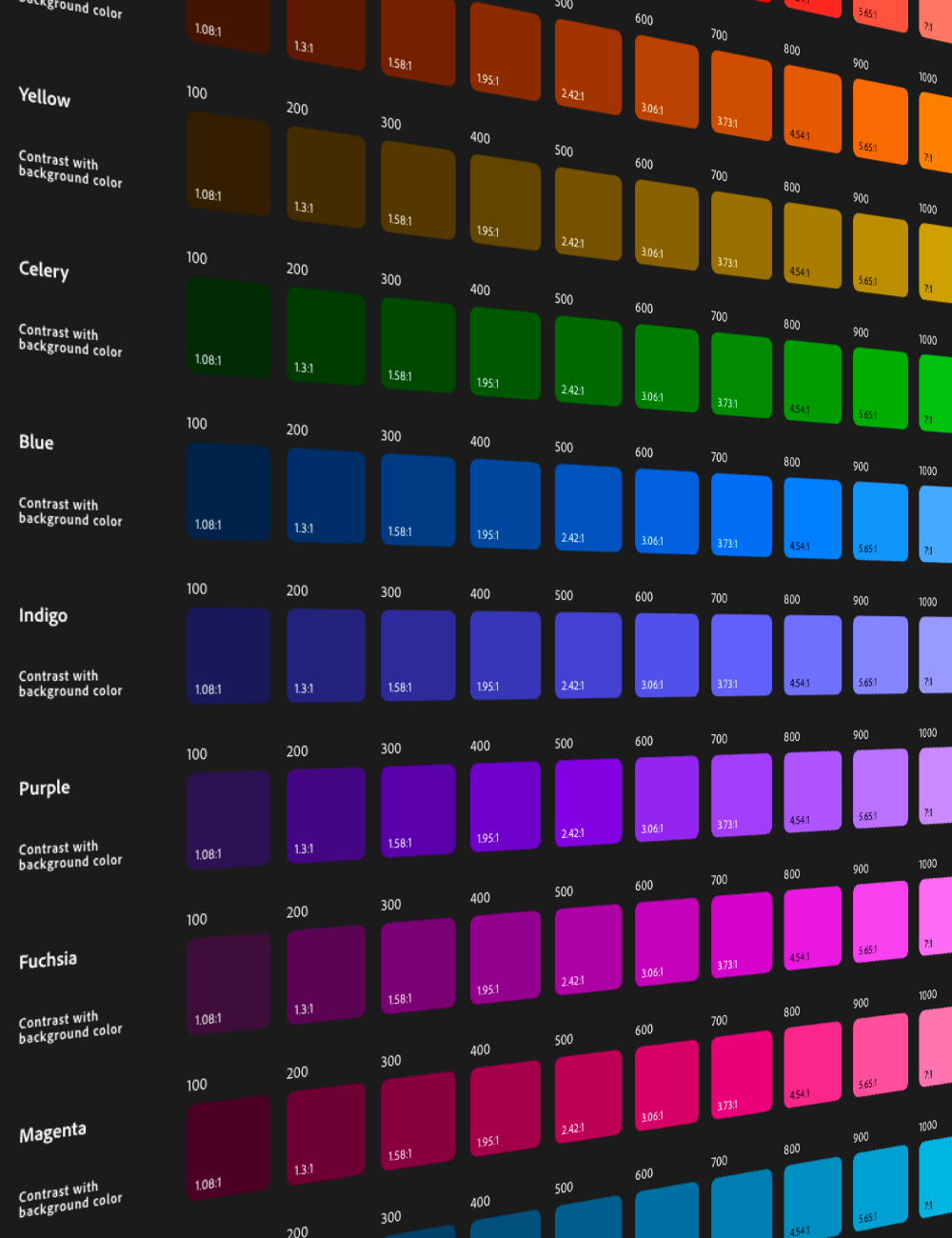
Supported interpolation colorspaces:
Below are the available options for interpolation in Leonardo:
Ratios as an array
When passing a flat array of target ratios, the output colors in your Theme will be generated by concatenating the color name (eg "Blue") with numeric increments. Colors with a positive contrast ratio with the base (ie, 2:1) will be named in increments of 100. For example, gray100, gray200.
Colors with a negative contrast ratio with the base (ie -2:1) will be named in increments less than 100 and based on the number of negative values declared. For example, if there are 3 negative values [-1.4, -1.3, -1.2, 1, 2, 3], the name for those values will be incremented by 100/4 (length plus one to avoid a 0 value), such as gray25, gray50, and gray75.
For example:
new Color({
      name: 'blue',
      colorKeys: ['#5CDBFF', '#0000FF'],
      colorSpace: 'LCH',
      ratios: [3, 4.5]
    });

    // Returns:
    [
      {
        name: 'blue',
        values: [
          {name: "blue100", contrast: 3, value: "#8d63ff"},
          {name: "blue200", contrast: 4.5, value: "#623aff"}
        ]
      }
    ]
Ratios as an object
When defining ratios as an object with key-value pairs, you define what name will be output in your Leonardo theme.
new Color({
      name: 'blue',
      colorKeys: ['#5CDBFF', '#0000FF'],
      colorSpace: 'LCH',
      ratios: {
        'blue--largeText': 3,
        'blue--normalText': 4.5
      }
    });

    // Returns:
    [
      {
        name: 'blue',
        values: [
          {name: "blue--largeText", contrast: 3, value: "#8d63ff"},
          {name: "blue--normalText", contrast: 4.5, value: "#623aff"}
        ]
      }
    ]
Output examples
There are two types of output you can get from the Theme class:
| Getter | Description of output |
|--------|-----------------------|
| Theme.contrastColors | Returns array of color objects with key-value pairs |
| Theme.contrastColorPairs | Returns object with key-value pairs |
| Theme.contrastColorValues | Returns flat array of color values |
Theme.contrastColors
Each color is an object named by user-defined value (eg name: 'gray'). "Values" array consists of all generated color values for the color, with properties name, contrast, and value:
[
      { background: "#e0e0e0" },
      {
        name: 'gray',
        values: [
          {name: "gray100", contrast: 1, value: "#e0e0e0"},
          {name: "gray200", contrast: 2, value: "#a0a0a0"},
          {name: "gray300", contrast: 3, value: "#808080"},
          {name: "gray400", contrast: 4.5, value: "#646464"}
        ]
      },
      {
        name: 'blue',
        values: [
          {name: "blue100", contrast: 2, value: "#b18cff"},
          {name: "blue200", contrast: 3, value: "#8d63ff"},
          {name: "blue300", contrast: 4.5, value: "#623aff"},
          {name: "blue400", contrast: 8, value: "#1c0ad1"}
        ]
      }
    ]
Theme.contrastColorPairs
Simplified format as an object of key-value pairs. Property is equal to the generated or user-defined name for each generated value.
{
      "gray100": "#e0e0e0";
      "gray200": "#a0a0a0";
      "gray300": "#808080";
      "gray400": "#646464";
      "blue100": "#b18cff";
      "blue200": "#8d63ff";
      "blue300": "#623aff";
      "blue400": "#1c0ad1";
    }
Theme.contrastColorValues
Returns all color values in a flat array.
[
      "#e0e0e0",
      "#a0a0a0",
      "#808080",
      "#646464",
      "#b18cff",
      "#8d63ff",
      "#623aff",
      "#1c0ad1"
    ]
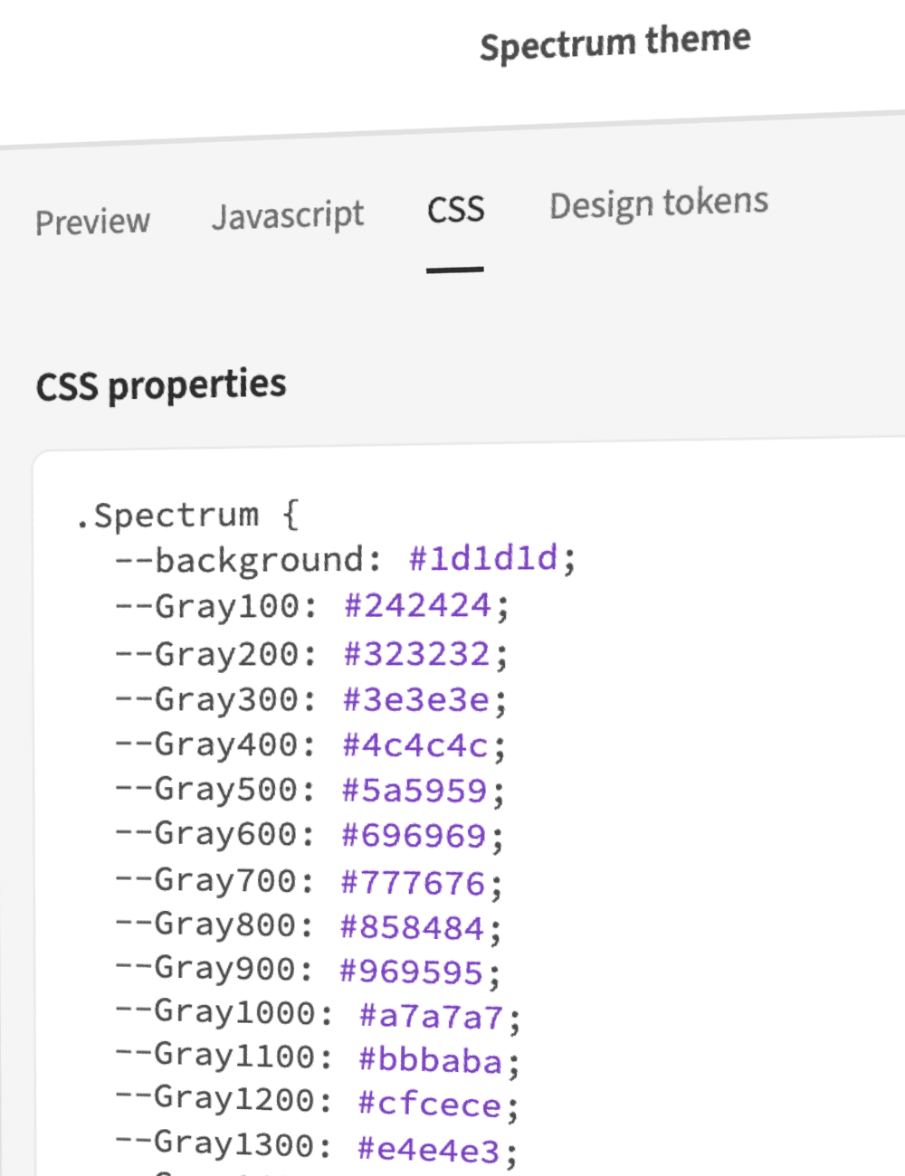
Leonardo with CSS variables
Here are a few examples of how you can utilize Leonardo to dynamically create or modify CSS variables for your application.
Vanilla JS
let varPrefix = '--';

    // Iterate each color object
    for (let i = 0; i < myTheme.length; i++) {
      // Iterate each value object within each color object
      for(let j = 0; j < myTheme[i].values.length; j++) {
        // output "name" of color and prefix
        let key = myTheme[i].values[j].name;
        let prop = varPrefix.concat(key);
        // output value of color
        let value = myTheme[i].values[j].value;
        // create CSS property with name and value
        document.documentElement.style
          .setProperty(prop, value);
      }
    }
React
Create a new Theme component Theme.js with your parameters:
import * as Leo from '@adobe/leonardo-contrast-colors';

    const Theme = () => {
      let gray = new Leo.BackgroundColor({
        name: 'gray',
        colorKeys: ['#cacaca'],
        ratios: [2, 3, 4.5, 8]
      });

      let blue = new Leo.Color({
        name: 'blue',
        colorKeys: ['#5CDBFF', '#0000FF'],
        ratios: [3, 4.5]
      });

      let red = new Leo.Color({
        name: 'red',
        colorKeys: ['#FF9A81', '#FF0000'],
        ratios: [3, 4.5]
      });

      const adaptiveTheme = new Leo.Theme({
        colors: [
          gray,
          blue,
          red
        ],
        backgroundColor: gray,
        lightness: 97,
        contrast: 1,
      });

      return adaptiveTheme;
    }

    export default Theme;
Then import your Theme component at the top level of your application, and pass the Theme as a property of your app:
// index.js
    import Theme from './components/Theme';

    ReactDOM.render(
      <React.StrictMode>
        <App adaptiveTheme={Theme()}/>
      </React.StrictMode>,
      document.getElementById('root')
    );
In your App.js file, import useTheme from css-vars-hook and provide the following within your App function in order to format Leonardo's output in the structure required for css-vars-hook.
// App.js
    import {useTheme} from 'css-vars-hook';

    function App(props) {
      const [lightness, setLightness] = useState(100);
      const [contrast, setContrast] = useState(1);

      const _createThemeObject = () => {
        let themeObj = {}
        props.adaptiveTheme.contrastColors.forEach(color => {
          if(color.name) {
            let values = color.values;
            values.forEach(instance => {
              let name = instance.name;
              let val = instance.value;
              themeObj[name] = val;
            });
          } else {
            // must be the background
            let name = 'background'
            let val = color.background;
            themeObj[name] = val;
          }
        })
        return themeObj;
      };

      const theme = useState( _createThemeObject() );

      const {setRef, setVariable} = useTheme(theme);

      return (
        <div
          className="App"
          ref={setRef}
          >
        </div>
      )
    }
To make your application adaptive, include a function for updating your theme before your return function:
  function _updateColorVariables() {
        let themeInstance = _createThemeObject();

        for (const [key, value] of Object.entries( themeInstance )) {
          setVariable(key, value);
        }
      };
      // call function to set initial values
      _updateColorVariables();
Finally, reference this function and set the theme parameters when your users interact with slider components (do the same for Contrast):
<label htmlFor="lightness">
      Lightness
    </label>
    <input
      value={lightness}
      id="lightness"
      type="range"
      min={ sliderMin }
      max={ sliderMax }
      step="1"
      onChange={e => {
        setLightness(e.target.value)
        props.adaptiveTheme.lightness = e.target.value
        _updateColorVariables()
      }}
    />
    <label htmlFor="contrast">
      Contrast
    </label>
    <input
      value={contrast}
      id="contrast"
      type="range"
      min="0.25"
      max="3"
      step="0.025"
      onChange={e => {
        setContrast(e.target.value)
        props.adaptiveTheme.contrast = e.target.value
        _updateColorVariables()
      }}
    />
Dark mode support in React
Include the following in your App.js file to listen for dark mode. This will pass a different lightness value (of your choice) to Leonardo. It's recommended to restrict the lightness range based on mode in order to avoid inaccessible ranges and to provide a better overall experience
const mq = window.matchMedia('(prefers-color-scheme: dark)');
    // Update lightness and slider min/max to be conditional:
    const [lightness, setLightness] = useState((mq.matches) ? 8 : 100);
    const [sliderMin, setSliderMin] = useState((mq.matches) ? 0 : 80);
    const [sliderMax, setSliderMax] = useState((mq.matches) ? 30 : 100);

    // Listener to update when user device mode changes:
    mq.addEventListener('change', function (evt) {
      props.adaptiveTheme.lightness = ((mq.matches) ? 11 : 100)
      setLightness((mq.matches) ? 11 : 100)
      setSliderMin((mq.matches) ? 0 : 80);
      setSliderMax((mq.matches) ? 30 : 100);
    });
Why are not all contrast ratios available?
You may notice the tool takes an input (target ratio) but most often outputs a contrast ratio slightly higher. This has to do with the available colors in the RGB color space, and the math associated with calculating these ratios.
For example let's look at blue and white. Blue: rgb(0, 0, 255) White: rgb(255, 255, 255) Contrast ratio: 8.59:1
If we change any one value in the RGB channel for either color, the ratio changes: Blue: rgb(0, 1, 255) White: rgb(255, 255, 255) Contrast ratio: 8.57:1
If 8.58 is input as the target ratio with the starting color of blue, the output will not be exact. This is exaggerated by the various colorspace interpolations.
Since the WCAG requirement is defined as a minimum contrast requirement, it should be fine to generate colors that are a little more accessible than the minimum.
Chroma.js
This project is currently built using Chroma.js with custom extensions to supportCIE CAM02. Additional functionality is added in Leonardo to enhance chroma scales so that they properly order colors by lightness and correct the lightness of the scale based on HSLuv.
Contributing
Contributions are welcomed! Read the Contributing Guide for more information.
Development
You can run tests and watch for changes with:
yarn dev
Licensing
This project is licensed under the Apache V2 License. See LICENSE for more information.
Leonardo を学ぶ
カラー
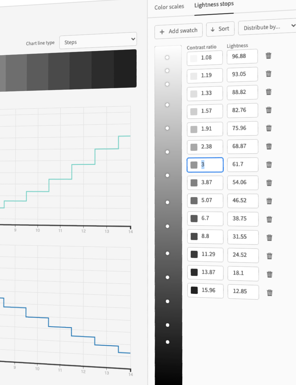
カラーシステムタブでは、カラーパレットと各色のカラースケールを定義します。
カラーパレットはシステムの主要な色を表します。ここでは
カラースケールは、各パレットカラーの明度変化を通した連続的な階調を表します。これにより、明度と彩度のグラデーションを意識した設計が可能になります。
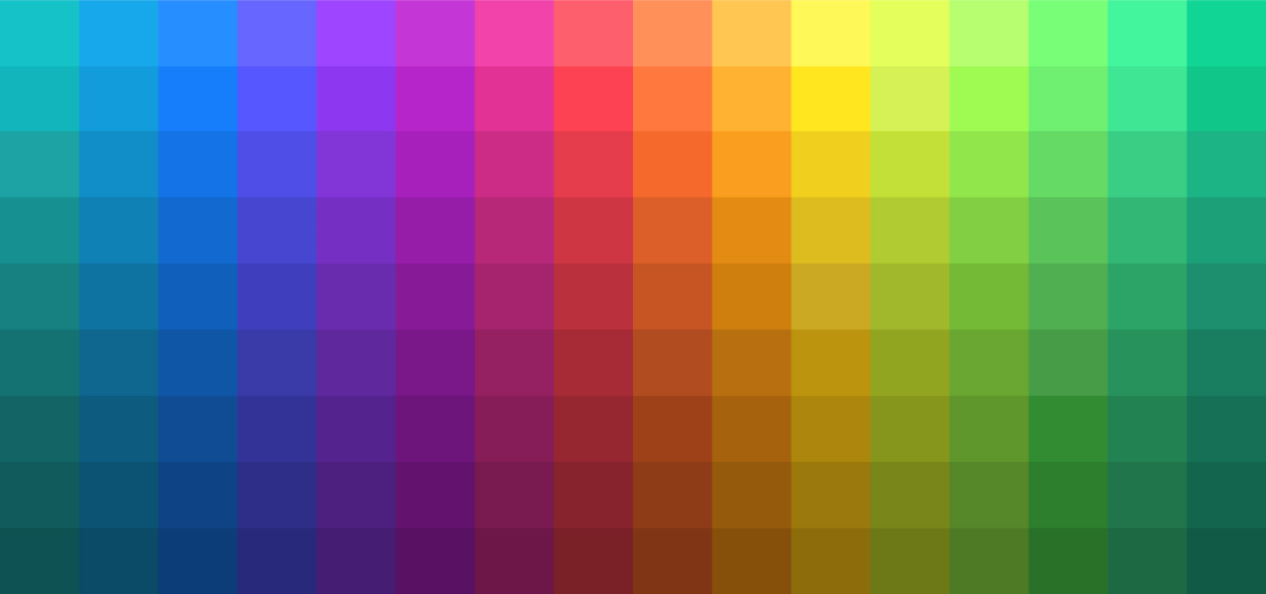
カラースケールは「カラーキー」「補間色空間」「スムージング」の 3 要素で構成されます。
カラーキー
カラーキーはスケール内に含めたい特定の色です。各キーは明度に基づいて自動的に並び替えられ、グラデーション上に配置されます。これにより、暗部から明部へ一貫した明度変化が保たれます。
補間色空間
カラーキーと黒・白の間をどの色空間で補間するかを指定します。色空間ごとに色の定義が異なるため、同じカラーキーでもグラデーションの見た目が変化します。
スムージング
Leonardo では
記事
Creating contrast-based themes with Leonardo
Medium.com
Leonardo: an open source contrast-based color generator
Medium.com
Adaptive Color in Design Systems: Part one
Medium.com
Adaptive Color in Design Systems: Part two
Medium.com
Adaptive Color in Design Systems: Part three
Medium.com

Colorimetry and the Cartography of Color
Medium.com